Creates a plot for likert scale
Arguments
- x
Variable to plot on the x axis (the likert scale responses or averages)
- y
The variable containing an index of the different items, should be integers
- leftLab
The variable with anchors for the low end of the Likert scale
- rightLab
The variable with anchors for the high end of the Likert scale
- colour
A character string giving the name of a variable for colouring the data, like a grouping variable. Alternately the colour of points passed to
geom_point- data
The data to use for plotting
- xlim
A vector giving the lower an upper limit for the x axis. This should be the possible range of the Likert scale, not the actual range.
- title
A character vector giving the title for the plot
- shape
A number indicating the point shape, passed to
geom_point- size
A number indicating the size of points, passed to
geom_point
Examples
library(JWileymisc)
library(ggplot2)
library(ggpubr)
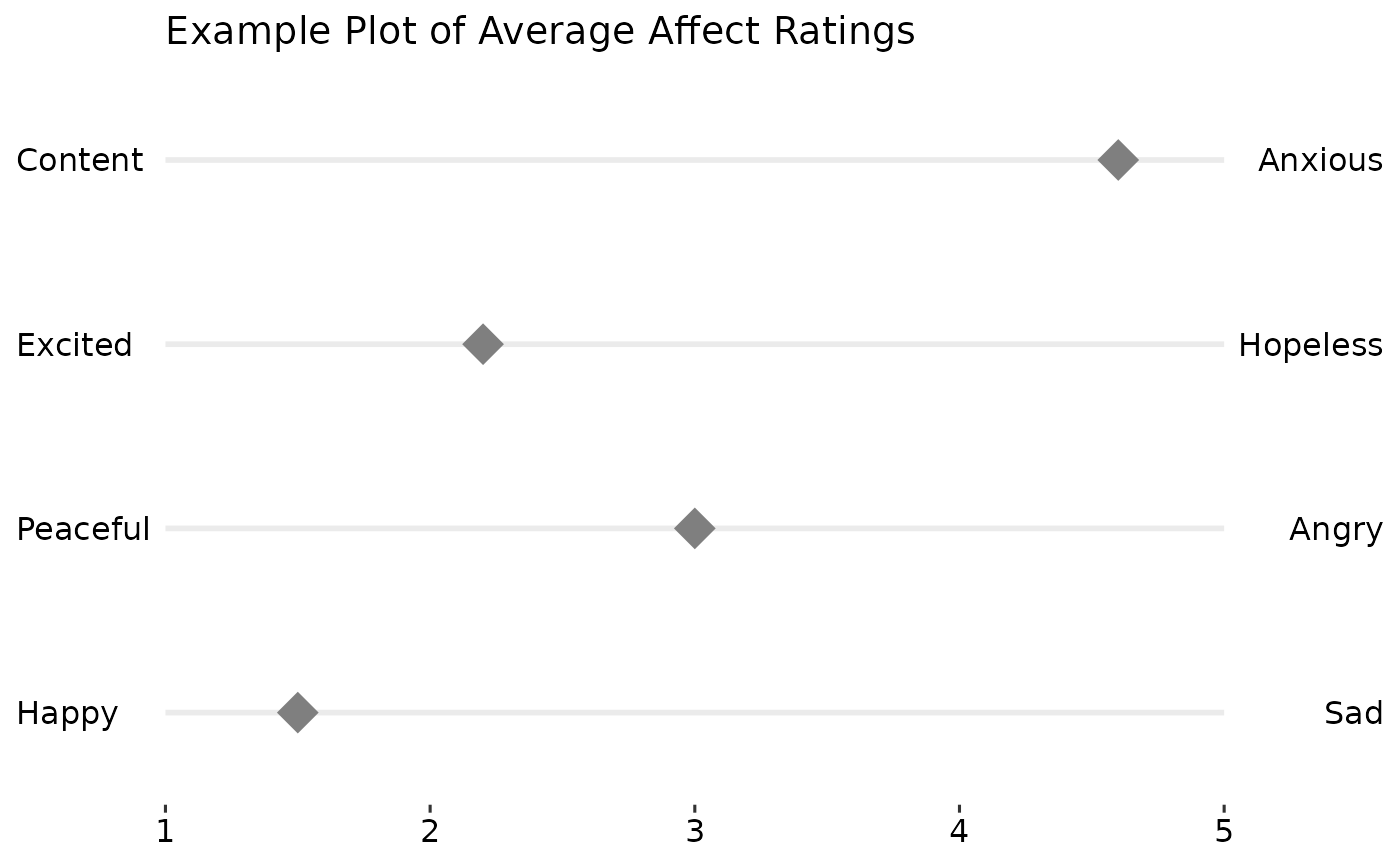
testdat <- data.table::data.table(
  Var = 1:4,
  Mean = c(1.5, 3, 2.2, 4.6),
  Low = c("Happy", "Peaceful", "Excited", "Content"),
  High = c("Sad", "Angry", "Hopeless", "Anxious"))

gglikert("Mean", "Var", "Low", "High", data = testdat, xlim = c(1, 5),
  title = "Example Plot of Average Affect Ratings")


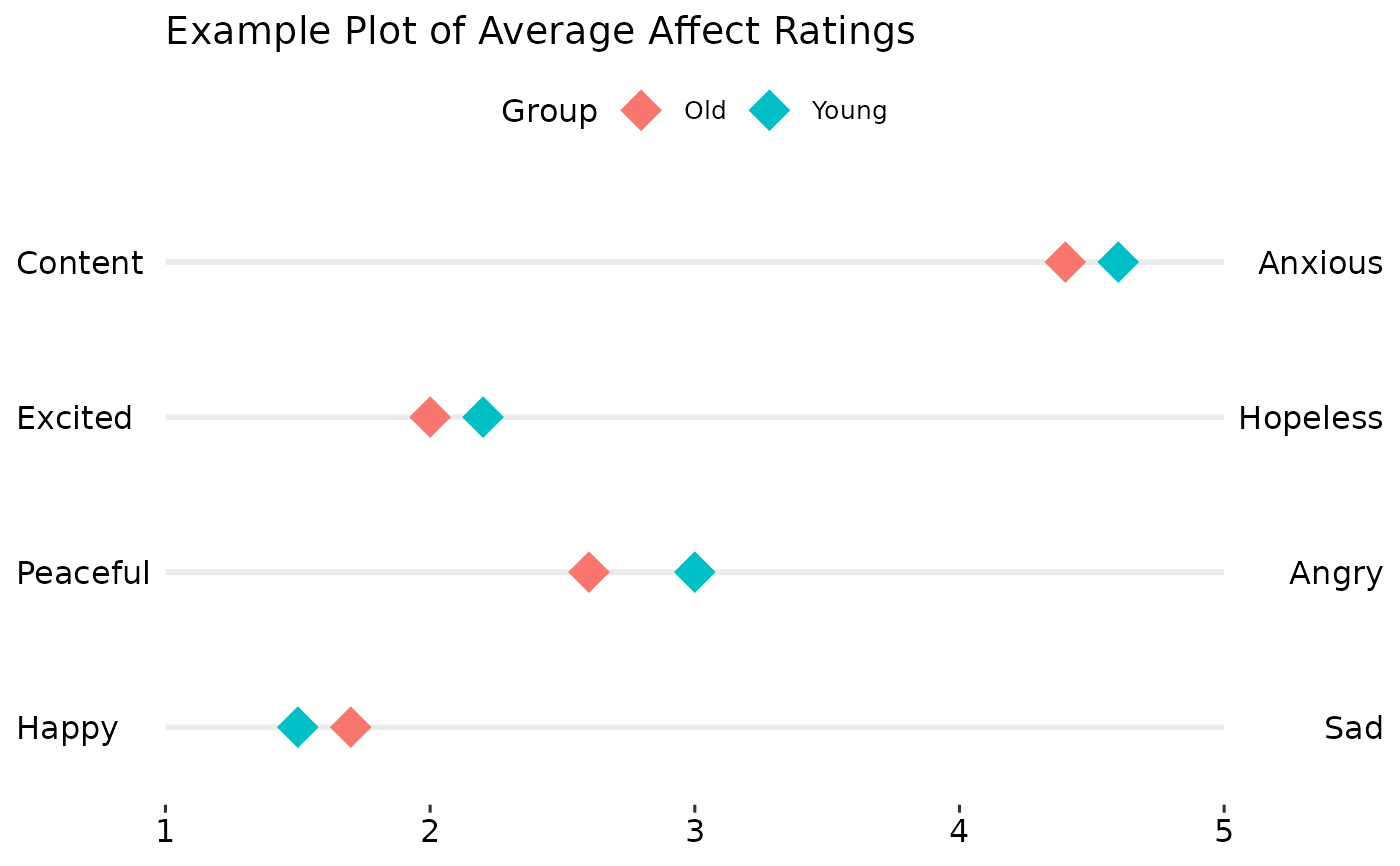
testdat <- rbind(
  cbind(testdat, Group = "Young"),
  cbind(testdat, Group = "Old"))
testdat$Mean[5:8] <- c(1.7, 2.6, 2.0, 4.4)

gglikert("Mean", "Var", "Low", "High", colour = "Group",
  data = testdat, xlim = c(1, 5),
  title = "Example Plot of Average Affect Ratings")


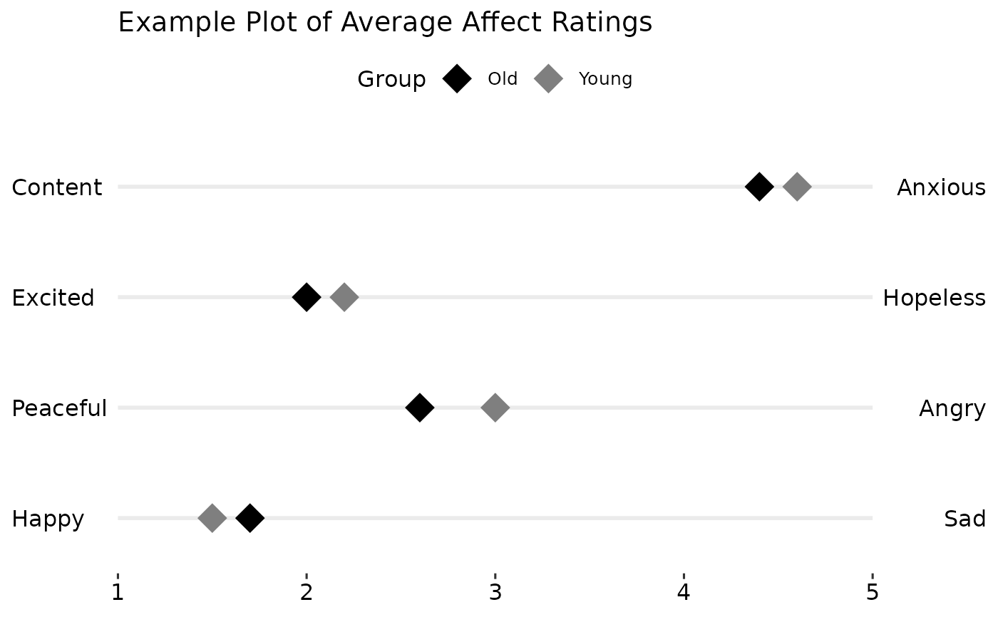
gglikert("Mean", "Var", "Low", "High", colour = "Group",
  data = testdat, xlim = c(1, 5),
  title = "Example Plot of Average Affect Ratings") +
ggplot2::scale_colour_manual(values = c("Young" = "grey50", "Old" = "black"))


## clean up
rm(testdat)